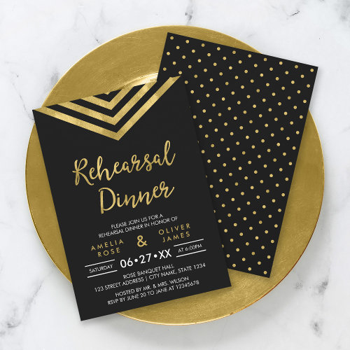
Here’s an example post that demonstrates various ways that NiftyGridZPro can be used creatively to improve your blog posts. You’re not restricted to plain old grids between some paragraphs, not when you get a bit creative!
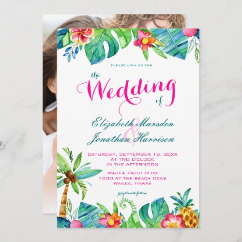
We’ve used wedding-themed products – pretend that instead of all the “how it’s done” stuff, there’s a gorgeously written article all about weddings, illustrated with occasional products.
Embedded on the right in a paragraph
Update Oct 11 2017: Now catered for using new shortcode option: paragraph_embed
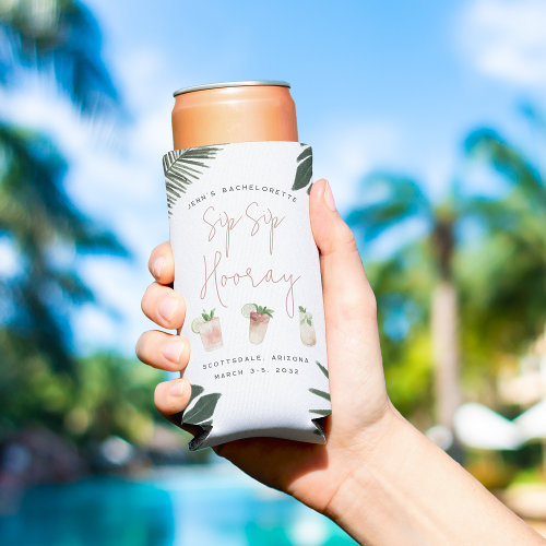
Here’s what we did to get this paragraph looking like this. In text mode we enclosed the shortcode for the grid in a div. Still in text mode, we gave that div an inline style that floats it to the right of the text that follows.
Here’s the enclosing div and shortcode we used: <div style="float: right;">[niftygridzpro title_font_size="12px" cell_max_width="200px" cell_border_color="#aaaaaa" description_font_size="12px" description_length="0" search_term="bachelorette party" page_size="1" page_number="1" product_background_color="#ffffff" tracking_code="ngrdz_blg_eg_layts"]<div style="font-size:small;text-align:center;margin-top:-30px;">Something for the Bachelorette?</div></div>
Embedded on the left
Update Oct 11 2017: Now catered for using new shortcode option: paragraph_embed
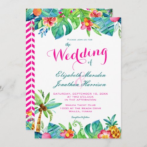
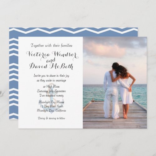
In the following paragraph, a page_size=4 grid has been used. Instead of it being floated to the right, this time it’s floated to the left. More than that, the inline style sets its max width to half that available.
One thing to remember, make sure that there’s enough width for those viewing on mobile! It’s easy to overlook but remember that 50% of your visitors, more as time goes on, are going to be using mobile devices. Ok, here’s the div-wrapped shortcode: <div style="float: left;max-width: 50%;">[niftygridzpro title_font_size = "9px" title_alignment = "center" cell_max_width = "110px" cell_border_color = "#aaaaaa" cell_background_color = "#ffffff" cell_font_color = "#333333" description_font_size = "12px" description_length = "0" include_product_names_in_titles = 0 use_message_slot = 0 store_or_collection = "" search_term = "chevron wedding" department_id = "252145500430512226" page_size = "4" page_number = "1" product_background_color = "#ffffff" tracking_code = "ngrdz_blg_eg_layts"]</div>
Creative, or wot?!
So make with the divs, don’t be afraid to go small and when you do, mess around with the details that are shown for each product. We’ll leave it as an exercise for you to work out how to show no details at all 🙂
Tip
If you’re going to use single-product grids somewhere that space is tight, make sure you have a generic fallback grid the same size mentioned in your shortcode.
That way your layout will be preserved should Zazzle go down. The same goes for any layout where the number of products matters.
