Pre-staging Area

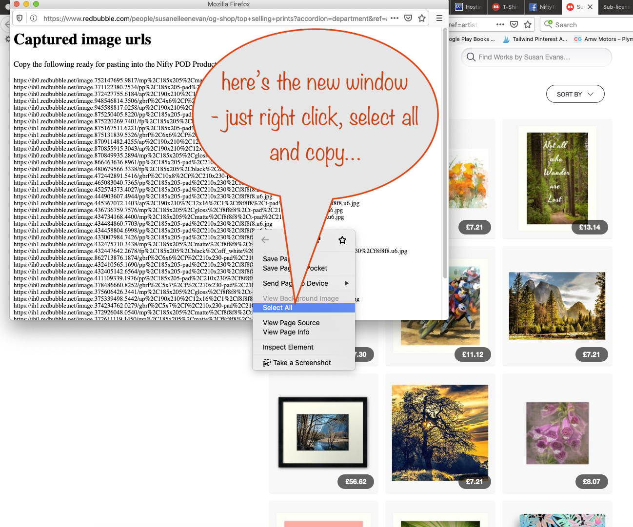
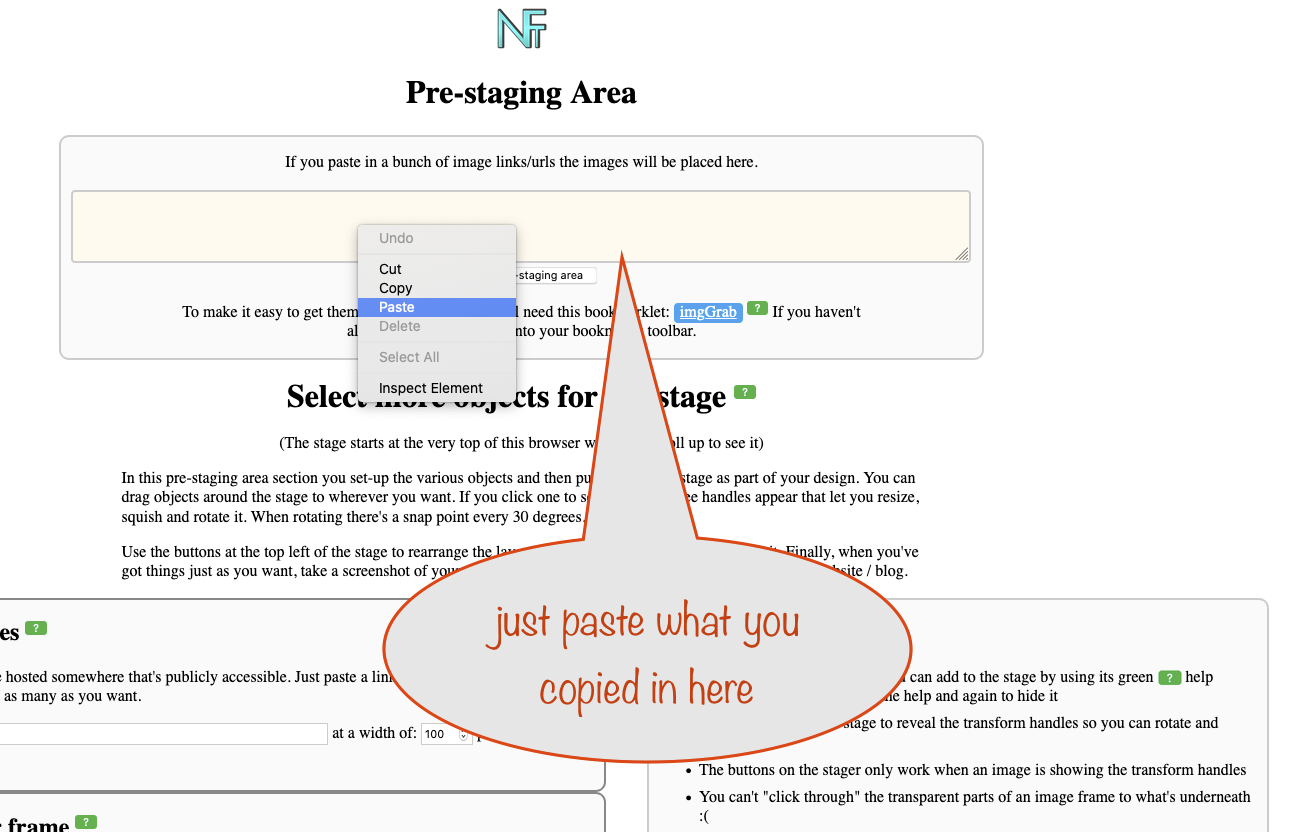
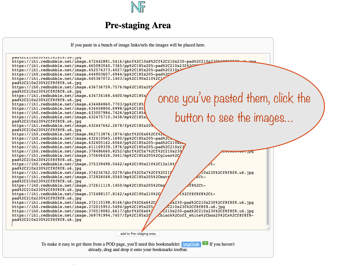
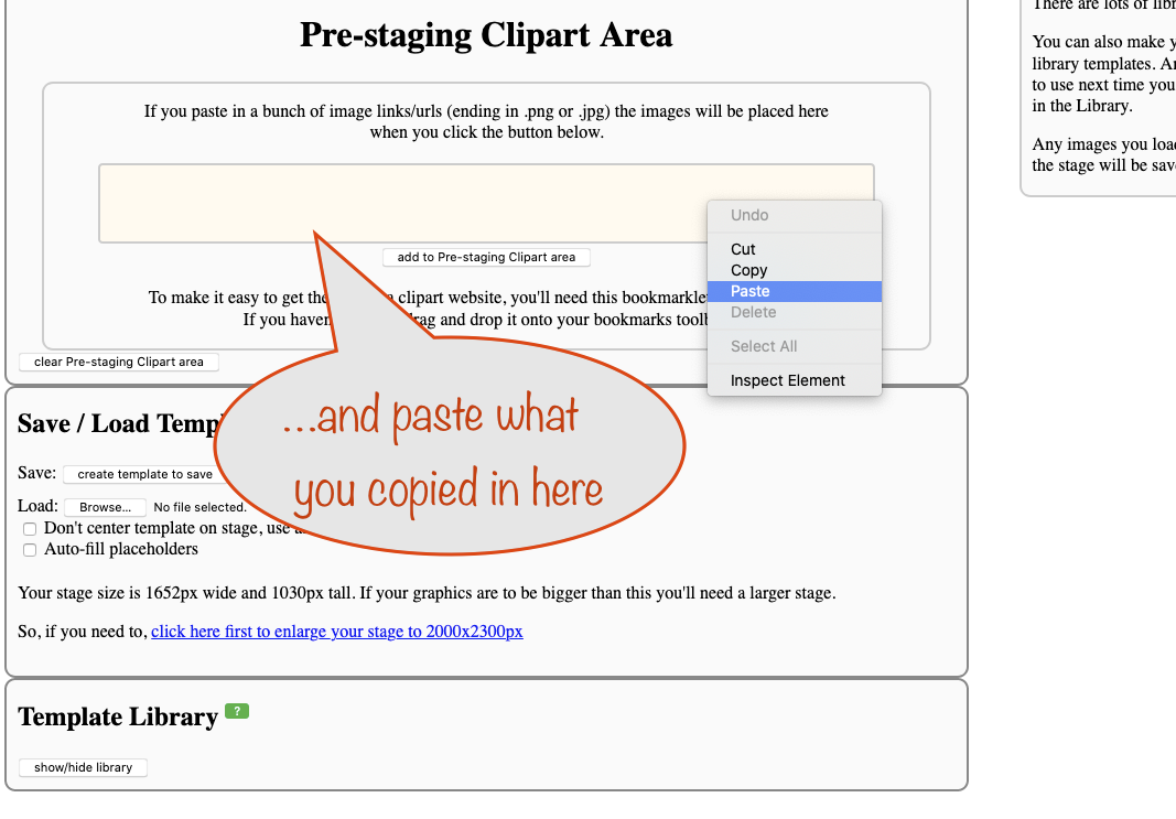
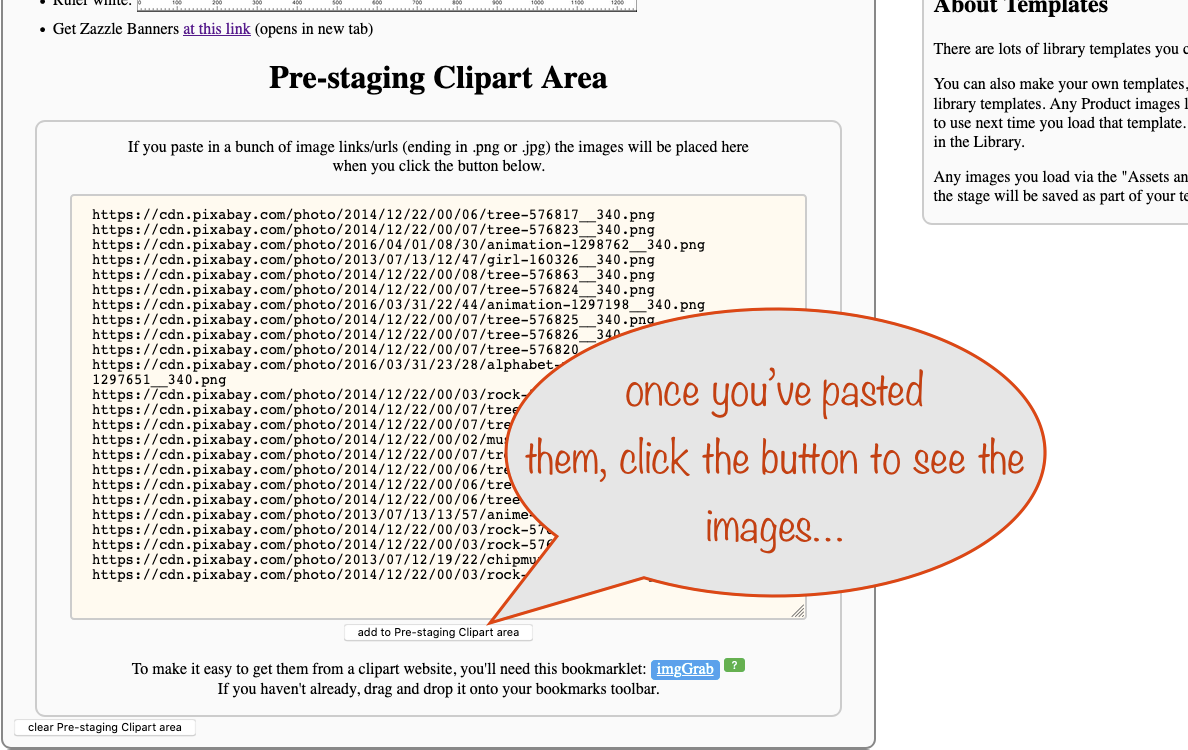
If you paste in a bunch of image links/urls (ending in .png or .jpg) the images will be placed here when you click the button below.


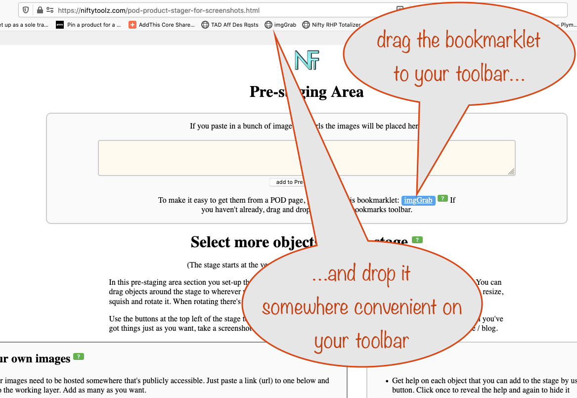
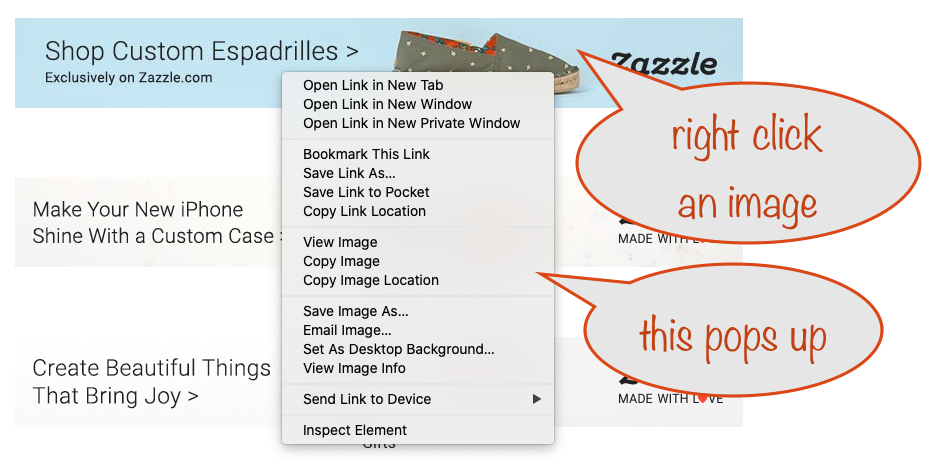
To make it easy to get them from a POD page, you'll need this bookmarklet: imgsGrab If you haven't already, drag and drop it onto your bookmarks toolbar.

A bookmarklet is a normal bookmark that does some magic instead of taking you to a web address. When you click or tap the bookmarklet, it will perform its magic on the page you're looking at instead of loading a different page, as most bookmarks do.

The magic that the imgsGrab bookmarklet does for you is to let you grab image locations (urls) from almost any POD webpage so you can copy and paste them here.
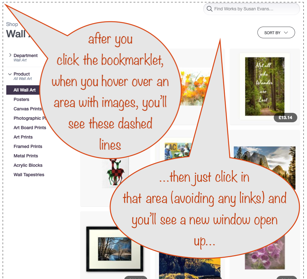
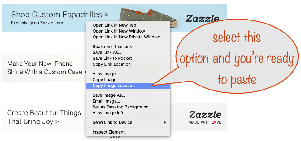
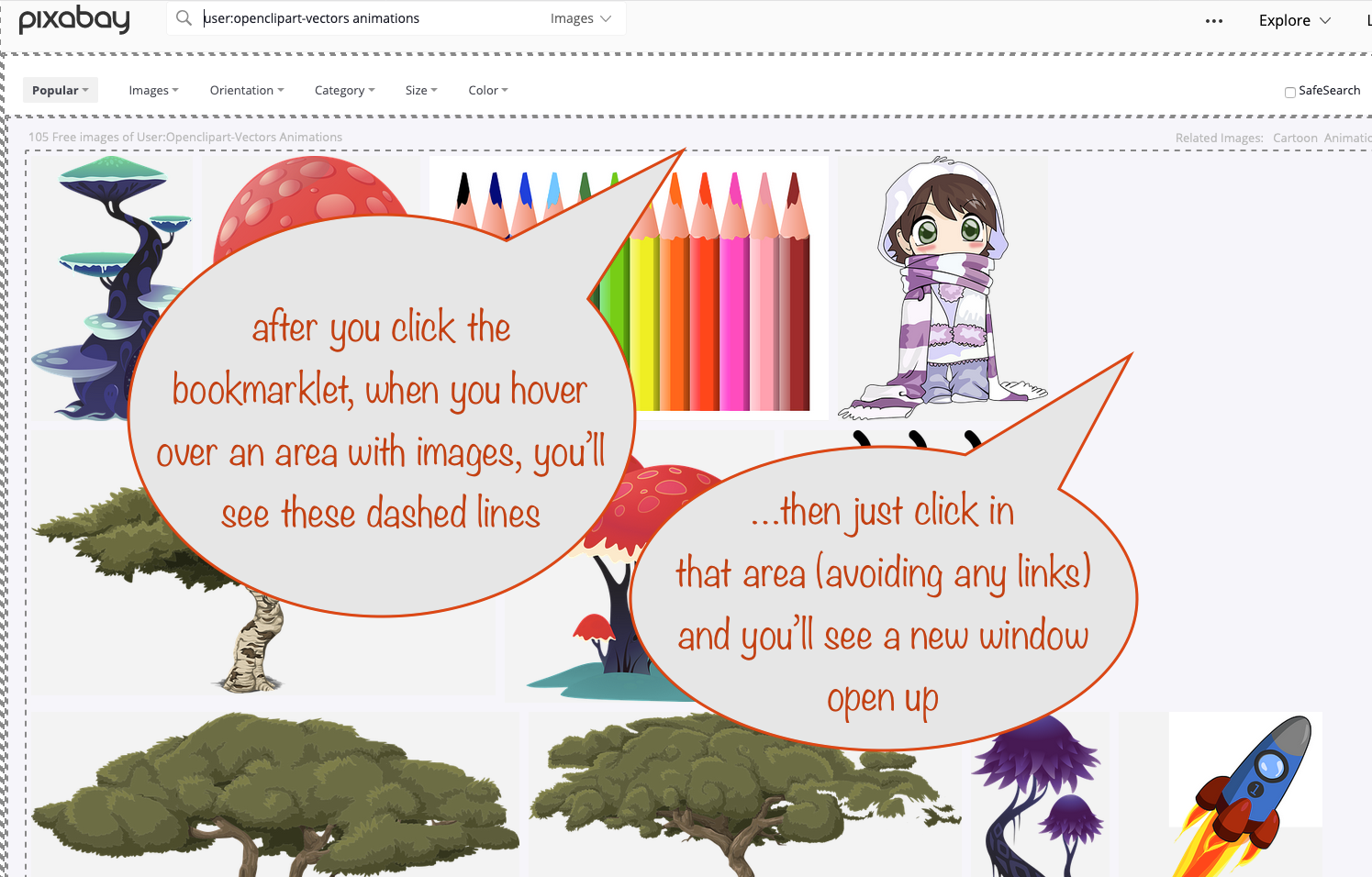
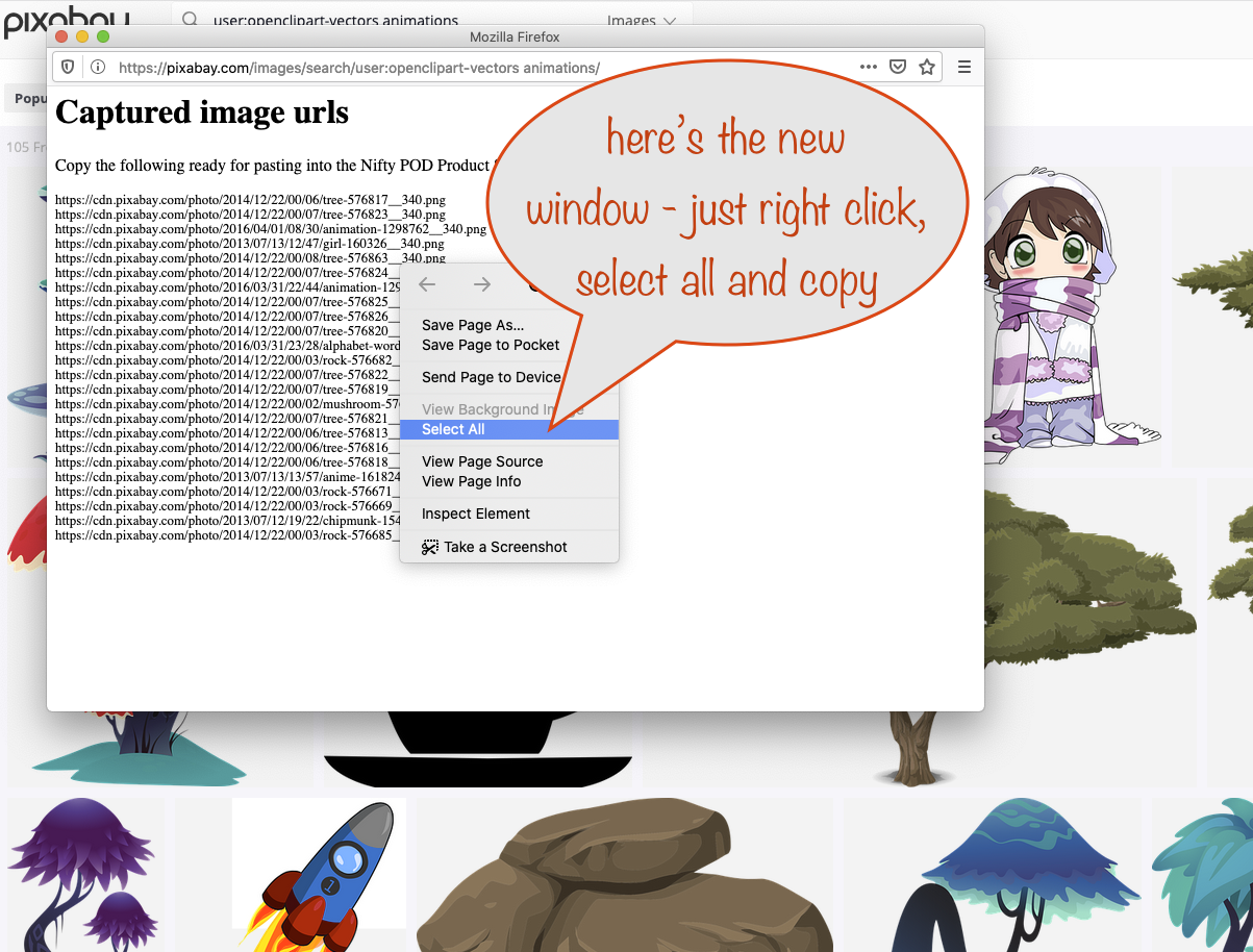
To use it:

  • first make sure your bookmark toolbar is showing at the top of your browser.
    If it's not showing, here's a handy place to find out how to show your bookmarks toolbar on your browser
  • Once you can see it, just drag the bookmarklet above to your toolbar and drop it where you want.
  • Next, go to pretty much any POD site, get to your own store and navigate to a page of products you want to use
  • Now's the time to click the imgsGrab bookmarklet
  • Scroll to where the images are showing and, as you move your mouse, watch for the dotted lines appearing around each section where they're showm
  • Once the right section is highlighted click in that area and after a short pause a new window will open with the image locations (urls) showing ready for you to copy and paste here (if you don't see it, check it's not hidden by your main window)

It might take a bit of practice to get just what you want. If you need to try again just click the bookmarklet again to reactivate it properly - and make sure the results window doesn't get accidently hidden by your main browser window!

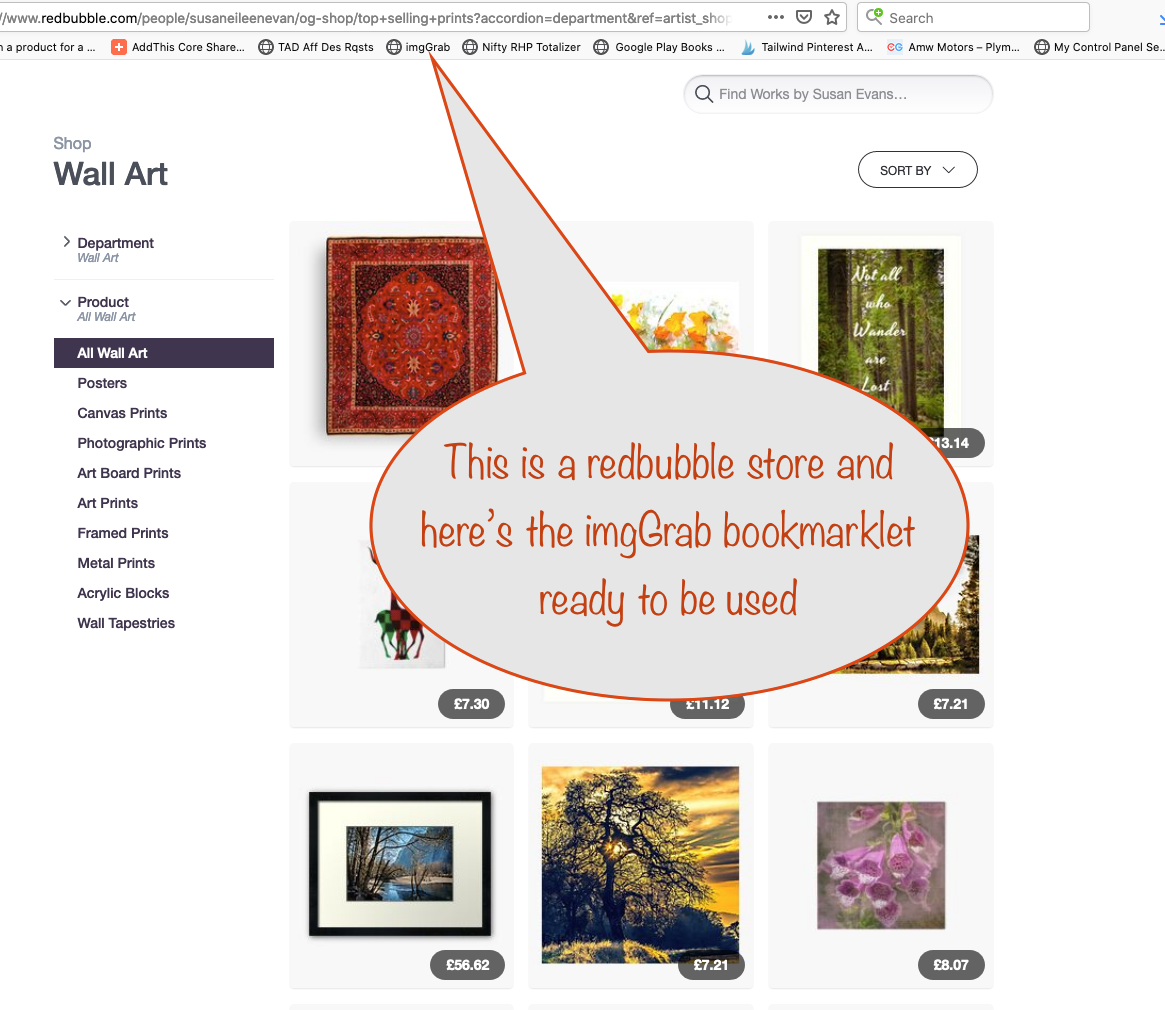
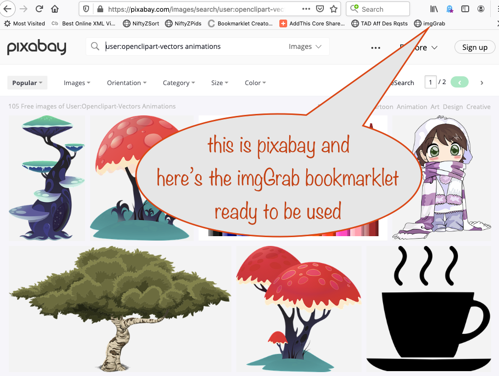
The sites it works on include:

  • pixieset.com
  • fineartamerica.com
  • teepublic.com
  • redbubble.com
  • cafepress.com
  • artpal.com
  • displate.com
  • creativefabrica.com
  • teefury.com

The sites it doesn't work on include:

  • teespring.com
  • threadless.com
  • cowcow.com

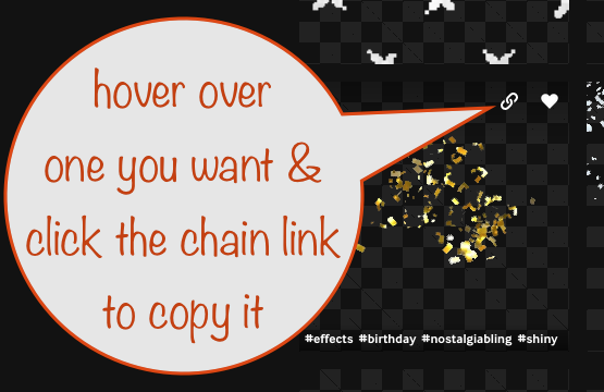
Here's a series of images showing you how

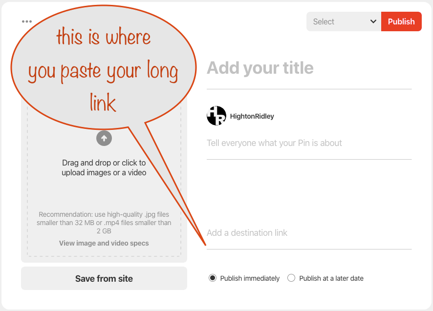
If you want your store link automatically added to templates that support it, put it here
Same goes for your store's name

Select more objects for the stage

Note for designers at Zazzle and Society6

If you're a Zazzler or a Society6er, there's more! You can start this stager pre-populated with products pulled from those places.

Visit the Zazzle Nifty Promo Control Panel or the S6 Nifty Promo Control Panel
and in Step 1 set up the products you want to use in the stager. When you've done that, in Step 2, choose the Share a product grid page section and then click the button for the flexible product stager for screenshots

That's all there is to it! :)

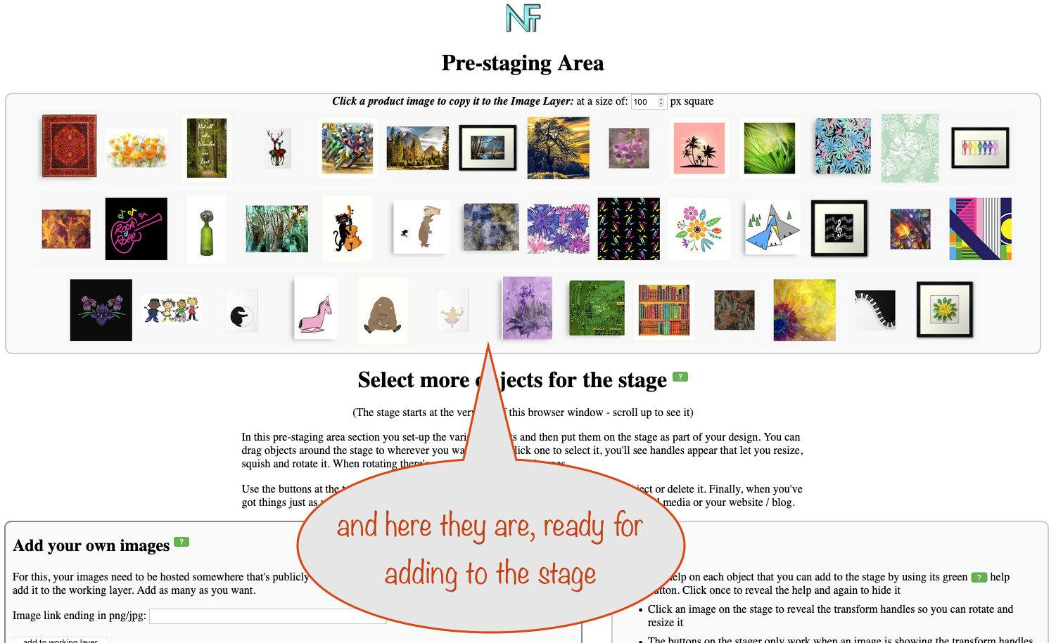
(The stage starts at the very top of this browser window - scroll up to see it)

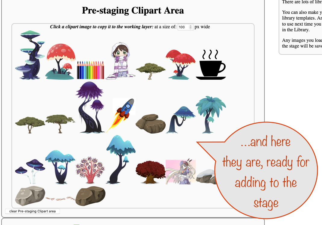
In this pre-staging area section you set-up the various objects and then put them on the stage as part of your design. You can drag objects around the stage to wherever you want. If you click one to select it, you'll see handles appear that let you resize, squish and rotate it. When rotating there's a snap point every 30 degrees.

Use the buttons at the top left of the stage to rearrange the layer order of the selected object or delete it. Finally, when you've got things just as you want, use the button on the stage to save your graphic ready for use on social media or your website / blog.

Add your own images

Add Stickers

Add a simple colour frame

Add stage text

Assets and images

Save / Load Template

About saving and loading templates

When you save, everything is saved except product images. Instead, these become placeholders with their locations, rotations and sizes saved in the template, used next time you load it. You can see what we mean by using one of the templates in the Library. When you do, make sure you toggle placeholders on and you'll see red outlines wherever there's a placeholder.

The file you load must be one previously saved by the product stager to ensure the format is right.

To save your current design as a template, first click the create template to save button to generate the template ready for downloading. You'll then be given a link to click to actually download it. The filename used is nifty-product-stager-template.txt.

Finally, if you're making a template for Instagram and want optimum shares, you need to rename your template file to include the word 'instagram'. This allows the Product Stager to double the pixel dimensions (no loss of quality) when you use the template in future and save a graphic based on it.

Save:
Load: Auto-fill placeholders:

Don't skip over this section - it contains all sorts of useful stuff! If you're like the rest of us, you'll ignore it for a while and then regret you didn't look earlier - just like with the green help buttons ;)

Loading fonts... spinner
  • Acme
  • Kanit
  • Cinzel
  • IM Fell English SC
  • Neuton
  • Playfair Display
  • ZCOOL XiaoWei
  • Aclonica
  • Anton
  • Englebert
  • Jockey One
  • Orbitron
  • Pathway Gothic One
  • Roboto
  • Russo One
  • Saira Extra Condensed
  • Syncopate
  • Architects Daughter
  • Audiowide
  • Barriecito
  • Berkshire Swash
  • Bubblegum Sans
  • Bungee Shade
  • Cherry Cream Soda
  • Creepster
  • Emilys Candy
  • Fascinate Inline
  • Faster One
  • Fontdiner Swanky
  • Gochi Hand
  • Henny Penny
  • Indie Flower
  • Italianno
  • Lakki Reddy
  • Luckiest Guy
  • Mansalva
  • Mountains of Christmas
  • Nosifer
  • Pacifico
  • Patrick Hand
  • Petit Formal Script
  • Rancho
  • Rye
  • Sedgwick Ave Display
  • Shadows Into Light
  • Slackey
  • Snowburst One
  • Special Elite
  • Spirax
  • Sunshiney
  • Vast Shadow
  • Yeon Sung
  • Yeseva One

Tips

About Layers

About Templates

Make best fit placeholders

What are best fit placeholders?

They're a set of placeholders that automatically fit into the space you allocate for them.

It can be a right royal pain to design a template starting from scratch so that's why this mini-tool exists - to take away the pain.

When you're ready, hit the button to generate your frame and placeholders - it may take a few seconds as there's a lot going on behind the scenes.

Then just fill your placeholders with images, change the background layer frame to suit, add anything else you need and save your lovely new template!

If you want to start again, don't forget to clear the stage!

Choose the social media you are making this graphic for:

Edit frame

Editing frames

You can edit or copy any of the elements of a frame on the stage with the controls below. First, select the frame you want to change / copy. Once it's showing the selection / transform handles, you're good to go.

Put a check mark next to the things you want applied and remove the check from those you don't.

Fill colour: colour lock enabled
- use transparent fill instead with opacity of %
(0=fully transparent)

Border colour: colour lock enabled
Border width: px
Width (incl border): px
Height (incl border): px
Corner radius: px

Edit text

Editing text

You can edit / copy any of the elements of the text on the stage with the controls below. First, select the text you want to change / copy. Once it's showing the selection / transform handles, you're good to go.

If you change the words, they'll be re-flowed to fit within the paragraph width.

Put a check mark next to the things you want applied and remove the check from those you don't.


Font size: px apply on change
Font: apply on change
Font Colour: colour lock enabled
Text para width: px
Text alignment:


Stroke:
Animation Text

About the animation text

There are two types, end-text and mid-text. You can set any text as either but it works best on text that's on the background layer, hidden behind a frame. You can have one end-text and up to four mid-texts, depending on the number of peoduct images in your video.

Every library template with more than 3 product images have default ones set up (TBD: actually, only Pinterest & Generic ones for now). With 3 product images, only one is used and for templates with more than 12 product images, all 4 are used. They're spread fairly evenly but with a bias to being shown near the beginning. That's to engage viewers early and so encourage them to stick with the video.

You don't have to stick with the default end-texts. You can change what they say, and the colour, size and position of each.

  • First, use the select mid-text button for the one you want to work on
  • Next, use the button to copy selected attributes. When you've done that, make the changes as desired
  • Finally, apply to selected text to finish
  • You'll probably want to bring the text to the front so you can see what's what
  • If you do, don't forget to Send to back again afterwards


Base all mid-texts on first:

Product image borders

None Thin Medium Thick

Colour for border: colour lock enabled

Give all Product Images a border

You can give all your product images a border with a colour you choose. Put them on the stage first and then use the controls above to get the look you want.

Set colour theme

Setting Colour Theme - immediate effect

Easily get a colour theme that works with your products by choosing the colours that you want to base it on. Dark and light shades of the same-ish hue work well, as do adjacent colours on the colour wheel. But you choose what works for you.

The colour theme is regenerated and applied right away each time you change the defining colours.

The number of colours in the theme takes account of how many stage frames and texts you have, to make sure that the borders, fills and text colours are all different but related. If a frame uses a transparent fill, it'll be preserved.

Apply any final tweaks using the other editing panes to get exactly what you want.

Define range of colours used in the theme:

Move stage contents

Up Down Left Right    Amount: px

Adjust things on the stage to suit your needs

Sometimes you need to move everything around - for convenience or to make room.

For example, when using a graphic to go above your product images and there's not enough space, just move everything down some.

Edit video animation settings

Change how your video looks

Note: to change the animation end text or the mid-texts, use the Edit text pane.

Right now, you can use either the default Expander animation style or the Dancer one.

If you're making a video for use on Twitter, check the box to make sure the video dimensions don't exceed what's allowable there.

If you want your video to be high definition (best for YouTube, Pinterest and Facebook), leave the box checked.

If you want to change the default size / position for the Expander style you get when you load a template:

  • first select an existing product image
  • Next, change its size and position to where you want and hit the button
  • Finally, move the product image back to where it came from:
    • make sure you've toggled the placeholders on
    • select the product image again (so the transform handles are showing) and drag it back into place
    • Because the placeholders are on, the product image will snap back into position at the original size
for Twitter resize video to HD
Animation style: Dancer Expander

Animation speed: Slower Normal Boost Max
Rapid preview (not saveable)

Edit gif animation settings

Change how your animated gif looks

Your animated gif can include just product images and message frames or it can also include a background image as well.

Message frames - huh, what are they? - they're just non-product graphics you can make to go in your animation. They could be other pictures but they're really designed to let you 'speak' to the viewer to get your message across. Many of the anmated gif templates provided include them but you can replace them with your own or take them out entirely.

The template layout (if you use one) and any text is ignored for animated gifs. All product images on the stage are combined from the back-most image to the front, so add as many as you want and don't worry about layout.

You can choose how quickly your animation flips to showing the next product by selecting one of the given values for the delay between images.

You also get to choose how big the product images / message frames are in your animation - the smaller sizes are good for blog sidebars.

If you want to use a background, here's how:

  • First, add your background image to the stage with the Add your own images section. Add it as a 'normal' image.
  • Next, adjust its size on the stage to what you want and make sure it stays selected
  • Once you've done that, click the Use selected image and its size button. You'll then see the size info displayed underneath the button.
  • With that done, now you set the position of the animation on the background:
    • Select one of the product images and drag it into place
    • With it still selected (so the transform handles are showing) click the Use the selected image's position button
    • ...for a few seconds, the selected product image will expand to the animation size as selected above
    • ...so you can give it a quick visual check

With that all done, you're ready to make your animated gif.

NB: The template layout and any text is ignored for animated gifs.

Delay between images (seconds)
5 4 3.5 1.5 0.75

Animated product width in pixels - max is 695 and is the default:

180 250 550 695
OR use the following, if not set to 0
px wide


Using a background image

Add one using the Add your own images section

Set the background image to use with your gif

background image size:

Set the position of the images that will be animated, relative to your chosen background image

position relative to top left of background image:

Cheat Sheet

Useful things to know:

News

About News

Every time there's a change to this Nifty tool we'll announce it here. Whenever there's a new announcement, the previous one you saw will be shifted into the history.

If we need to, we'll update the current announcement instead of making a new one.

If you've hidden the news until there's a new announcement, you won't see updates. If you want to check for updates to the existing announcement from time to time, start the tool with this ?shownews=yes (and nothing else) immediately after the .html up in the address bar.

If you don't use the tool for a while, you may miss some announcements entirely and they won't be in your history - but that's ok, just visit the Facebook group linked below if there's a new feature you need help with :)

The buttons give you full control over what's displayed in this panel or whether the panel itself is displayed at all, with an option to keep it hidden until there's a new announcement.

One final point: we'll also show you here if there's a general announcement about Nifty that we think you need to see - but it won't be added to your history for this tool.

If you need help about any announcement made, visit the NiftyToolZTips and Support Facebook group and ask there. To see an explanation of this tool, visit the Nifty Product Stager page on our site.