This week we’ve been tweaking things to make social media shares look much more appealing. This applies to
✅ Product Grid sharer page
✅ Slideshow sharer page
✅ Individual product sharers – Facebook, Twitter and Pinterest
The aim was to improve the look to someone seeing one, and improve its attractiveness to search engines (better SEO) as well.
We’ve done this for Zazzle and Society6 so now, whether you share on facebook, tweet, or pin on Pinterest, you’ll find you get much better engagement from the people who see them.
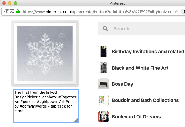
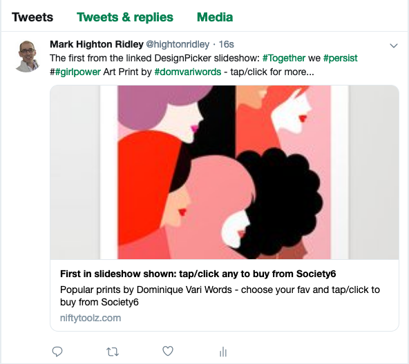
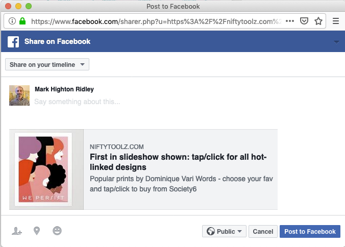
When you tweet, you’ll find the description pre-filled with a *hashtagged version of the first product’s title. Same when you pin on Pinterest. Unfortuanely Facebook doesn’t allow the status update text to be pre-filled.
*only words of 6 letters or more are turned into hash tags
For Twitter and Pinterest, the text underneath the linked image is taken from the page title, the one you set up in Nifty
Here’s what it looks like when you’re sharing a Society6 slideshow page on Pinterest and Facebook. An actual tweet is shown, as the sharing dialog wasn’t really that helpful. The Zazzle ones are much the same.
When you share your product grid pages for both Society6 and Zazzle, you’ll get pretty much the same results.
Anyone looking at them now will immediately see it’s just one of many, with the first one shown as the image. This wasn’t so obvious before.
We’ve not included screenshots for shares from the individual product pages but they’re similar, too.
As we’ve now included a hashtagged version of the first product’s title, your more likely to get found in relevant searches on Twitter and Pinterest. Now we’re using your product grid / slideshow title as the text under the image it will aslo help with search on Twitter and Facebook.
With the page title being one you make up in Nifty, you get a great opportunity to fine tune your title for SEO puposes – so make sure you make use of it! Remember, any word you use that has 6 or more characters will become a hashtag.