Blog

Business Designs for a Personal Chef

If you’re a chef and thinking about moving into a new area, such as becoming a Personal Chef, then you’ll need new business stationery and marketing material to help you promote it.

Personal Visiting Chef Experience  Business Card (Front)
Personal Visiting Chef Experience Business Card
by HightonRidley

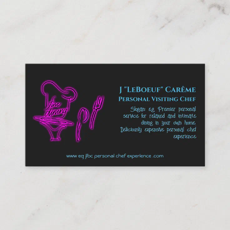
A great business card template for a visiting personal chef who provides fine dining in the privacy of people’s homes. All blue text can easily be changed when you click through to Zazzle.

Your new branding / design

Of course, you’ll need new branding and design to get across the core of your offering to potential clients, and there you have a choice:

  • either employ the services of a designer – expensive!
  • or choose from the thousands of existing templates on Zazzle and make them unique to you – the affordable route

💭

Your brand design also needs to convey things in such a way that what it inspires in a client’s imagination is so appealing that they’ll want to take the next step with you.

To summarize key aspects:

  • Core of offering – business name and slogan squarely aligns with it
  • Stand out from the rest – differentiation (unique-ish) selling point
  • When imagined by prospect, appeals – get your communications / phrasing right
  • consistency in branding across domains – business name, logo, slogan across social media / online / real world

Material to consider

  • essential stationery – business cards, menus, stickers,
  • others – champagne / wine / liquor bottle labels, window clings, wall and floor decals
  • marketing giveaways – pens, clocks, shot glasses, matches, coasters, keychains, can coolers, playing cards, lip balm, mouse mats
  • day-to-day use by you: napkins, placemats, serving trays, aprons, cutting boards, mugs, notebooks, planners

Page through the following Personal Visiting Chef Experience material, all using consistent design and branding:

<1 of 6>
<1 of 6>

If you’re a designer…

If you’re a designer and thinking about business designs for a personal chef then, as well as the above, you’ll also want to consider the following.

Consistency in branding

As a designer you’ll already know about the importance across all business communications of having the same / consistent:

  • logo
  • font(s)
  • slogan
  • colors

What you might not know about is how Zazzle can be the perfect ‘host’ and fulfiller for your designs. With its features to allow you to set template text and template images, your clients can easily replace text and images with their own.

Show how easy Zazzle product personalisation is on your Pinterest Carousel Pins

Find out how to include a personalization screenshot in your Pinterest carousel pins.

an example screenshot to include in your Pinterest Carousel pin

Why use Carousel Pins?

You’ll get far more exposure using Carousel pins on Pinterest because Pinterest likes them so much more than ordinary pins. That means it makes sense for you to use them whenever possible, time permitting. With their ability to include up to five images, you get the opportunity to use great in-situ pictures to show off great product designs.

If you want to speed up the whole process of making carousel pins of Zazzle products, see how to quickly get all product views in this tutorial (opens in a new tab / window)

Here’s a link to the Pinterest Carousel Pin I made using the above screenshot (opens in a new tab / window)

Why include a personalisation screenshot?

There are far more people who have never heard of Zazzle than the other way around. When they see a product they like, they might be put off by thinking that it’s too hard or a lot of work to personalise it.

If you use one of your carousel images to set their mind at rest, you’ll remove that obstacle to selling and increase your chance of a sale.

Luckily you can use a carousel pin to show just how easy it is to personalize the featured product with the template texts / images the designer’s used.

How to get a personalisation screenshot at the pixel dimensions that Pinterest likes?

Pinterest prefers large pixel sizes for images, with a minimum of around 1000px wide. Read on to find out how to get a screenshot of the relevant part of your browser’s contents at around that size.

What you need to do is to use your browser’s Zoom facility to first enlarge what the browser shows.

You do need to use Firefox for this because, at the time of writing, Chrome and Chromium-based browsers (think Edge, Vivaldi, Brave, Opera and others) all cut off a chunk of the right hand side of browser screenshots when zoomed in.

Get to the product page, open up the Personalize pane and then zoom in. The keyboard shortcuts for this are

  • Windows: <ctrl>+
  • Mac: <command>+

Zoom in a few times to make things really big. When you’ve done that, right-click a blank area of the browser window:

a screenshot showing how to use the right-click menu to let you take a screenshot of the browser's contents
using right-click to select “Take Screenshot”

Next, choose “take Screeshot”. If you prefer, you can use a keyboard shortcut to take the screenshot without right-clicking first:

  • Windows: <ctrl><shift>S
  • Mac: <command><shift>S

Whichever way you go about it, you’ll be given the option to save the full page or just the visible part; choose “Save full page”:

a screenshot showing the options to either "Save full page" or "Save visible"
choosing “Save full page”

Behind the scenes, Firefox prepares a file containing a screenshot of the whole web page. After a while you’ll be given a download button to click:

a screesnhot of Firefox's dialog to download the full web page screenshot you just took
telling Firefox to download the full web page screenshot you just took

Then just crop the image to the right size in your favorite image editing program. I use Preview on my Mac where I also add the speech bubbles.

Depending on the number of template texts / images, you might have to crop to an aspect ratio that’s not quite what you want. Never mind if that happens as you can adjust things when you’ve added it to your carousel pin.

Here’s the carousel pin I created with the above (opens in a new tab / window)

It’s not nearly as obvious as it should be that it’s a carousel pin because of the way that Pinterest displays them. It’s easy to confuse carousel pins with ordinary ones if you give them a quick glance.

The way to tell is to look for the forward-facing white arrow overlaid on the right-hand side. There’s also be a number of dots overlaid on the bottom indicating how many images are included in your carousel pin.

a screenshot of a carousel pin showing the arrow symbol to move to the next carousel image

I put my personalization screenshots as the last carousel image presently but I might be tempted to try them as the second or third image in future.

We’d love to hear your comments or suggestions to improve carousel pins – you know what to do 💐

Scaled up Solar Tracker – Winter Maintenance

A photo showing the winter maintenance in progress on the scaled-up solar tracker
winter maintenance in progress on the scaled-up solar tracker

The scaled-up solar tracker has been working really well since I installed it in the early autumn. Now that winter is approaching a quick check showed that there are some things to sort out:

  • black mold growing on the bottom of the interior of the box – caused by…
  • ..water getting into it via the hole for the lift-and-twist tube
  • the edges of the slot in the aluminium tube was damaged by the screw holding the guide pin. It came loose and, being in contact with the edges, it chewed them up some

So I needed a way of:

  • killing the black mold
  • stopping the water getting in
  • finding a better way of anchoring the guide pin

The first thing I did was to bring it indoors and remove some surface paint so that the partially water-logged wood could dry out. I gave it 4 or 5 days, checking daily with a multimeter on the ohms setting. Around the hole, it started out at around 5MΩ and, after drying out, raised to well over 100MΩ – good enough.

Killing the black mold

I used some specific black mold remover / preventer that I already had for treating it in bathrooms etc. I couldn’t use bleach as it only kills surface mold when it’s on wood.

After 48 hours drying time I repainted with 2 coats of undercoat and 2 topcoats.

Stopping the water getting in

I already had neoprene sealing strips around the flap used to close off the box at the front and they were working just fine.

The problem was where the lift-and-twist tube entered the top of the box.

After much head-scratching, I came up with a solution: a hood attached to the lift-and-twist tube that overlaps a tube connected to the box top. And done in such a way so that the lower part of the lift-and-twist tube is never directly exposed to the elements.

Parts

I happened to have these to hand and luckily it came together as planned:

a photo of the parts I used to prevent water getting into the box via the lift-and-twist tube hole
the parts I used to stop water getting in via the lift-and-twist tube

That self-amalgamating tape is a life-saver, useful in so many ways.
If you’ve not used it before, it’s not sticky but when you stretch it to around half it’s width or less, it ‘activates’ and will stick to itself. After around 10 minutes or so it starts to form a solid mass and after a few hours the process is complete.

Partially assembled

Here I’ve put everything in place to make sure it works as intended before fixing things to each other.

a photo of the assembled parts I used to prevent water getting into the box via the lift-and-twist tube hole
the parts partially assembled

With that done, onwards with the final assembly…

Fully assembled

I used black hot glue to fix the inner tube to the top of the box. The black hot glue sticks have a slightly higher melting point and seem to hold plastic better than the white or clear versions.

Even so, to protect it from the UV radiation that tends to break it down, I painted it with undercoat and a couple of top coats of white gloss.

Next I used more self-amalgamating tape to seal the join between the vitamin bottle (with the bottom cut off) and the cut-to-size caulk cartridge. That’s what I’m calling the hood. Finally I used the tape to attach the hood to the lift-and-twist tube as shown.

Anchoring the guide pin

The main problem was that the screw holding the guide pin only had 3mm of thread to screw into – that’s the wall thickness of the stainless steel lift-and-twist tube – and easily worked itself loose.

Again, more head-scratching and cogitating and then the solution came to me…

I took a length of wooden dowling that fitted nicely inside the lift-and-twist tube and was long enough to reach the bottom. I drilled out the threads on the tube and used a self tapping screw so it would fix firmly into the wood, through the hollow guide pin.

With the solution proved, I gently filed away where the slot edges had been chewed up some and then finished off with some wet-and-dry for the final smoothing.

Perfect 😎

Finishing off

The final step was to give the whole thing a couple more coats of gloss and that’s the winter maintenance complete.

I’ll be putting it back outside again in the spring – towards the end of February because that’s when the sun will be high enough in the sky to start reaching down into my back garden. I just need to find somewhere to store it until then!

I suppose I could put it outside….

Styling Text in WordPress the Lightning Quick and Easy Way

Ever wished you could easily highlight some text in the WordPress block editor and apply your own predefined text styling to it – without resorting to editing as html?

And better than that, only have to do it once for your whole site?

How does highlighting work “out of the box”?

As things stand, using the Block Editor’s rich text drop down, you can highlight text with one of 12 predefined colours (see the screenshot) for the foreground and the same ones for the background – or you can use a colour of your choice.

Here’s how you do it. Select some text and then:

You don’t have to use a pre-defined colour. Instead you can choose from the full colour palette by clicking the panel above the circles, if that’s what you want.

Maybe you’re writing a tutorial and want to mention the name of a button to click or to draw attention to a specific piece of text on a page that you’re talking about in your article.

Here’s how to apply your own text styling

Just to be clear this is applying styling to selected text within a block.

Here’s an example of text made to look like a button.

Limitations

  • It won’t show up in the editor unfortunately but it will when you preview and publish – but you can do something to show you’ve done it, read on to find out how
  • You only get 12 different types of text styling (explanation below)
  • You have to give up the ability to highlight text with a predefined colour (via the block editor’s rich text drop-down) for every one you “hijack”

How does it work?

The trick is to hijack what happens when I choose to highlight text using the block editor’s rich text drop-down.

Here, I’m hijacking the predefined colour called “Dark Purple”.

I know it’s called that because the name appears when I hover over it in the predefined colour palette. Note that in the following “Dark Purple” becomes “.has-dark-purple-color”.

.has-dark-purple-color
        {
            text-decoration: none;
            background-color: #ccc !important;
            color: Black;
            padding: 2px 6px 2px 6px;
            border-top: 1px solid #CCCCCC;
            border-right: 1px solid #333333;
            border-bottom: 1px solid #333333;
            border-left: 1px solid #CCCCCC;
            border-radius: 8px;
        }

The above is a css (cascading style sheet) definition that will make text look like a button – and you place it in your customizer‘s additional css area.

For this example, we’ll copy the above css and paste it in:

Once you’ve pasted it, you need to hit publish

Remember, you can only hijack the predefined colours, the ones with names.

Making sure you can see hijacking when editing your page

In the block editor, it helps to be able to see where you’ve used a hijacked highlight colour. The best way I’ve found to do this is to set its highlight background colour to one of the default ones.

If you’ve hijjacked both light and dark highlight text colours, you’ll need to use contrasting background colours for them to make sure that you can always see hijacked text.

When you’re editing the page / post, the background colour for any hijacked highlights is the one chosen via the rich text drop down and not the one set up in your css class override.

When you’re previewing or once the page is published, the class takes over and the background-color with the !important setting gets used instead.

The “publish” text in the screenshot has its background color set to light pink via the rich text drop down, as you can see in the screenshot.

When the page is previewed / published, you see the button styling instead (here it is again).

Tip

Remember that any hijacking will apply across your whole site. It’s because the hijacking method you learned here redefines the highlight colour classes.

You know, the ones that get applied when you use the rich text drop down for highlighting selected text within a block.

So be sure to choose wisely!

For example, I often refer to buttons in lots of posts and pages, so it makes sense to hijack a highlight colour class for displaying them in an obvious way.

Another example from this website: I’ve started to always say (opens in a new tab / window) when a link does that. So I’ve hijacked the bright blue highlight colour for that purpose. I don’t change the colour fom bright blue but I do set the font size to font-size: smaller

If you want to play around with css there’s a great css resource on w3schools.com (opens in a new tab / window)

I hope you’ve found this helpful and will put it to good use. We’d all love to hear how you’ve used it so drop off a comment to let us know!

Learn how to create Pinterest pins that get 20 X the impressions

I did some experiments with manually created pins because I wanted to see what the effect would be compared to those pinned using Pinterest buttons.

Impressions compared on very recent pins

Compare the impressions between the manually created pins (top image) and the pins created using a Pinterest pin (aka pin-it) button.

All of those pins were created in the last couple of hours and you can see the difference in impressions they’ve received already.

In a day or two, the manually created ones (Created heading) are going to be vastly better than the ones made with pin-it buttons (All Pins heading).

Impressions compared on 5-week-old pins

25 X the impressions compared to best-performing pin created with a button
(click to see larger – opens in a new tab / window)

The pins shown above were all created on October 1st 2022. The best performing pin created with a pin-it button got 9 impressions. Compare that with the manually created pin – it’s had 233 impressions in the same time frame!

So that’s 25 X the impressions. Read on to find out how you can achieve the same!

About pinning

When you use a Pinterest (aka pin-it) button to make a pin:

  • via the product page on Zazzle
  • using the Nifty Speed-Sharing tool
  • with the Nifty Auto-Pinner tool

..two observations:

  1. The description text on the pin is the standard, bland description Zazzle provides for the type of product being pinned.
    Yes, the designer’s description is ignored.
  2. Around the same time as the designer’s description started being ingnored in favour of Zazzle’s standard one, impression rates on pins of Zazzle products dropped really low

I can understand 1) to some extent – some of the descriptions designers give are eye-wateringly inappropriate:

  • some stuff them with keywords so they’re not actually descriptions
  • some just repeat the product’s title
  • some use a generic description that’s unrelated to the design

The downsides of those I think explains Zazzle’s reasoning: they go for a generic description of the product type so their reputation is unharmed.

The drop in pin impressions 2) that happened around the same time isn’t a surprise. Why? It’s likely because Pinterest factors in the uniqueness of a Pin’s description in deciding what to show on people’s feeds.

Best way forward?

Watch this video on how to quickly and easily create stonking pins that’ll attract lots of impressions:

If you’re a serious Zazzle designer with a limited amount of time to devote to promoting, I’d suggest a combination of manual pinning and speed-sharing.

With a little more time, or you’re a designer with a small affiliate hat, I’d recommend doing the same, but more of it with both your own and other people’s designs.

A serious designer-cum-affiliate will do auto-pinning, speed-sharing of great sellers and maybe half a dozen manually created pins per day.

Nifty

Of course, any of those type of people who value their time will be using Nifty already. Not only to speed up their promoting but to make it easy peasy as well.

You can use Nifty for free if you don’t mind a 50/50 split on any earned referral fees. If that doesn’t appeal, you can get a membership by paying a monthly subscription (link opens in a new tab / window).

It would be really cool to hear about your experiences with manually created pins, so if you don’t mind sharing them, drop off a comment. Thanks!